The phone finish: why polished ads underperform
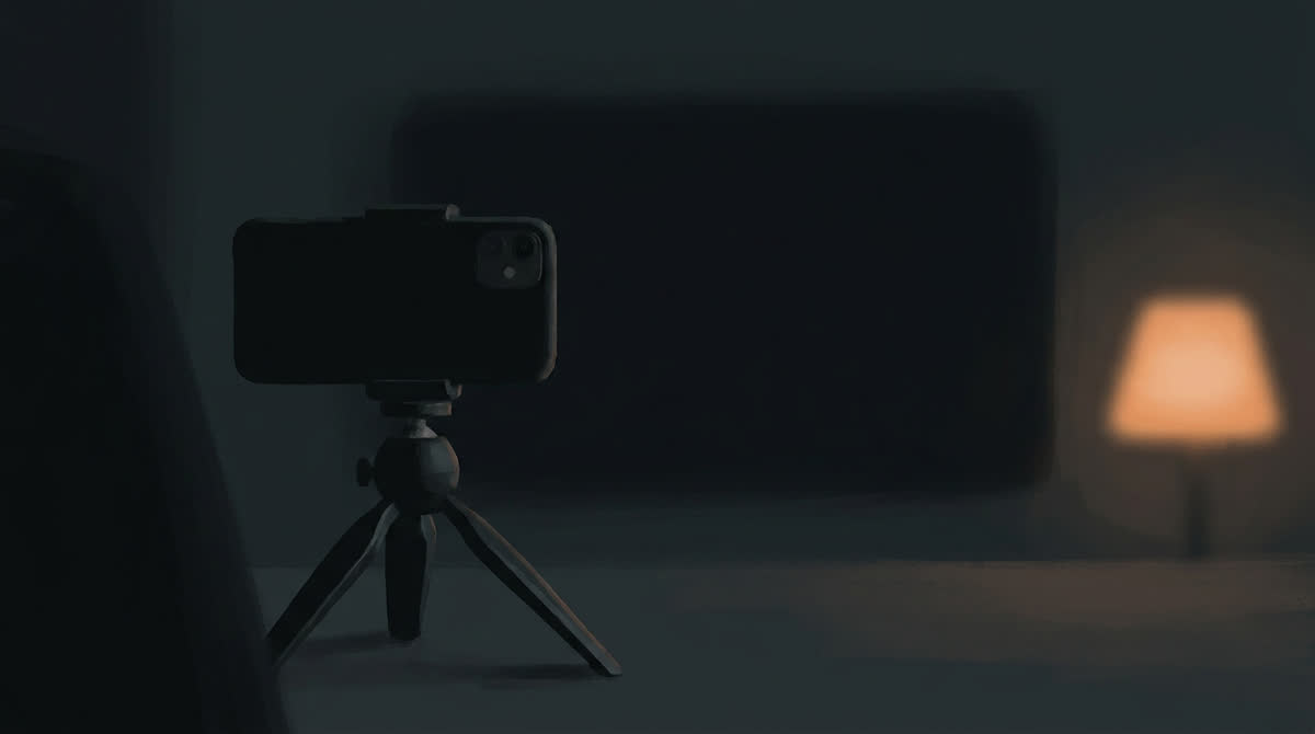
A well-lit, color-graded, tripod-steady ad tells the viewer something before it says a word: this was made by a company, for money, to sell you something. That signal fires in the first frames, and in a feed full of footage shot by people on phones, it is the fastest way to lose the scroll.
This is the reason the UGC category exists, and it is why deliberately unpolished creative routinely beats expensive creative in the same account. But "make it look worse" is not a usable instruction. Here is what specifically to remove, and where the floor is.
What polish actually consists of
Break it down and production polish is a handful of separable decisions, each of which can be dialled independently.
- Lighting — key, fill and separation, versus whatever light is in the room.
- Camera stability — tripod or gimbal, versus a hand.
- Framing — composed and level, versus adequate.
- Color — graded to a look, versus straight off the sensor.
- Audio — a treated room and a good mic, versus the room you are in.
- Pacing — cut to a rhythm, versus cut to the content.
Not all of these should be dialled down, and this is the part most people get wrong. Two of them should stay high.
What to remove
Three-point lighting. The strongest single change. Available light only — a window, a lamp, overheads. Let one side of the face fall into shadow. Let the background blow out behind a window. Mixed color temperature, warm lamp against cool daylight, is normal in real rooms and almost never survives a lighting setup.
Perfect stability. A held phone drifts. It corrects, overshoots slightly, settles. Not shake — shake is distracting and reads as a choice. Drift.
Composed framing. Slightly off-level. The subject not quite centered, occasionally too close to an edge. The top of the head cropped a little, which a real person holding a phone does constantly.
The color grade. Flat, slightly under-saturated, with whatever cast the room's light gives it. Teal-and-orange announces itself instantly.
Choreographed pacing. Cuts on the content, not on a beat. A pause left in because it was real. An ending that stops rather than resolves.
What to keep high
Audio quality. This is the exception, and it is not a small one. Viewers forgive bad picture and do not forgive bad sound — thin, clipped or hissy audio makes a video feel cheap in a way people wrongly attribute to the visuals. Keep the recording clean and the encoding generous. Compress the video hard if you need to; do not compress the audio hard.
What you want is audio that is clean but present: the room audible underneath, not a booth-recorded voice floating over street footage. Real ambience, well captured, at a decent bitrate.
Legibility. Captions large, high contrast, correctly timed. Nobody has ever found an ad more authentic because they could not read it.
The floor
There is a point past which unpolished stops reading as authentic and starts reading as broken. The markers:
- The face is not clearly visible.
- The speech is not intelligible on a phone speaker in a noisy room.
- The product cannot be identified when it appears.
- The shake is distracting enough to notice as shake.
- It looks like a mistake rather than a choice.
Authenticity is a texture, not an excuse. The ad still has to communicate.
Why this is harder with generated footage
Generation defaults to clean. Models are trained heavily on well-produced material, so the natural output is well-lit, stable, centered and evenly paced — exactly the register you are trying to avoid.
Which means imperfection has to be specified rather than merely permitted. Vague requests for realism produce a polished video that has been asked to be realistic. Specific instructions produce results: name the light source, name the camera position and the hand holding it, name what is untidy in the background, name where the speaker stumbles.
The useful mental shift is to stop describing how the video should look and start describing how it was supposedly captured. "Shot on a phone propped against a kettle, kitchen overheads on, afternoon light from the left" gets you further than any number of adjectives.
Matching the platform's own compression
A detail worth the effort: every platform re-encodes what you upload, and the result has a particular texture — slightly soft, slightly blocky in motion, with crushed shadows. Content that already has that texture looks native. Content delivered at pristine quality gets that texture applied to it anyway, but arrives looking conspicuously cleaner than everything around it in the feed.
You do not need to degrade anything deliberately. Simply do not fight it: deliver at sensible bitrates rather than maximum ones, and stop grading for a screen the ad will never be seen on.
How to check
Put the ad in a feed and scroll past it at normal speed on a phone. Do not watch it — scroll. If it announces itself as an advertisement before you have taken in what it is about, the polish is doing the wrong job. That five-second test catches more than any amount of reviewing on a monitor.
Where polish still belongs
None of this argues that production value is always wrong. It is wrong for a particular job: feed-native short-form ads aimed at people who did not ask to see them.
Polish still earns its place on a landing page, where the visitor has already chosen to be there and a cheap-looking video undermines confidence in the product. It belongs in brand films, on a product detail page, in anything shown to a retail buyer or an investor, and in categories where the purchase is considered and the audience expects a certain standard.
The error is applying one register everywhere. Brands routinely take the polished asset made for the website and run it as a feed ad because it exists and it looks expensive. That is the specific mistake worth stopping.
A practical test of how far to go
Take your current best-performing ad and describe it honestly on the six dials above. Then build one variant that moves two of them — usually lighting and stability — and nothing else. Run them against each other properly. You will learn where your particular audience's floor is, which is more useful than any general rule, including this one.